
Making knowledge visible — and wisdom impossible to look away from.
To produce a high-impact visual that instantly conveys the book’s foundation in the Bhagavad Gita, while integrating the essence of numerology — presenting both as powerful tools for perception, clarity, and inner transformation.
| Element | Direction |
|---|---|
| Numerical Focus | Emphasis on number 108 as the central visual element |
| Scriptural Reference | Geeta verse to anchor the spiritual theme |
| Product Visibility | Prominent and thoughtful — product is the hero |
| Color Palette | Brand-aligned tones for identity and consistency |
| Numerical Design | Numbers as symbolic or abstract design components |
| Spiritual Aesthetics | Light rays, sacred geometry, textures — elevated visual tone |


The book needed to feel like an experience, not an object. Compositions were built around symbolism — light, geometry, and sacred references — so the viewer felt the wisdom before they read a word.
The audience ranged from casual readers to tarot practitioners and Vastu consultants. Every frame had to work at both levels — immediately engaging for the uninitiated, resonant for those who understood the references.
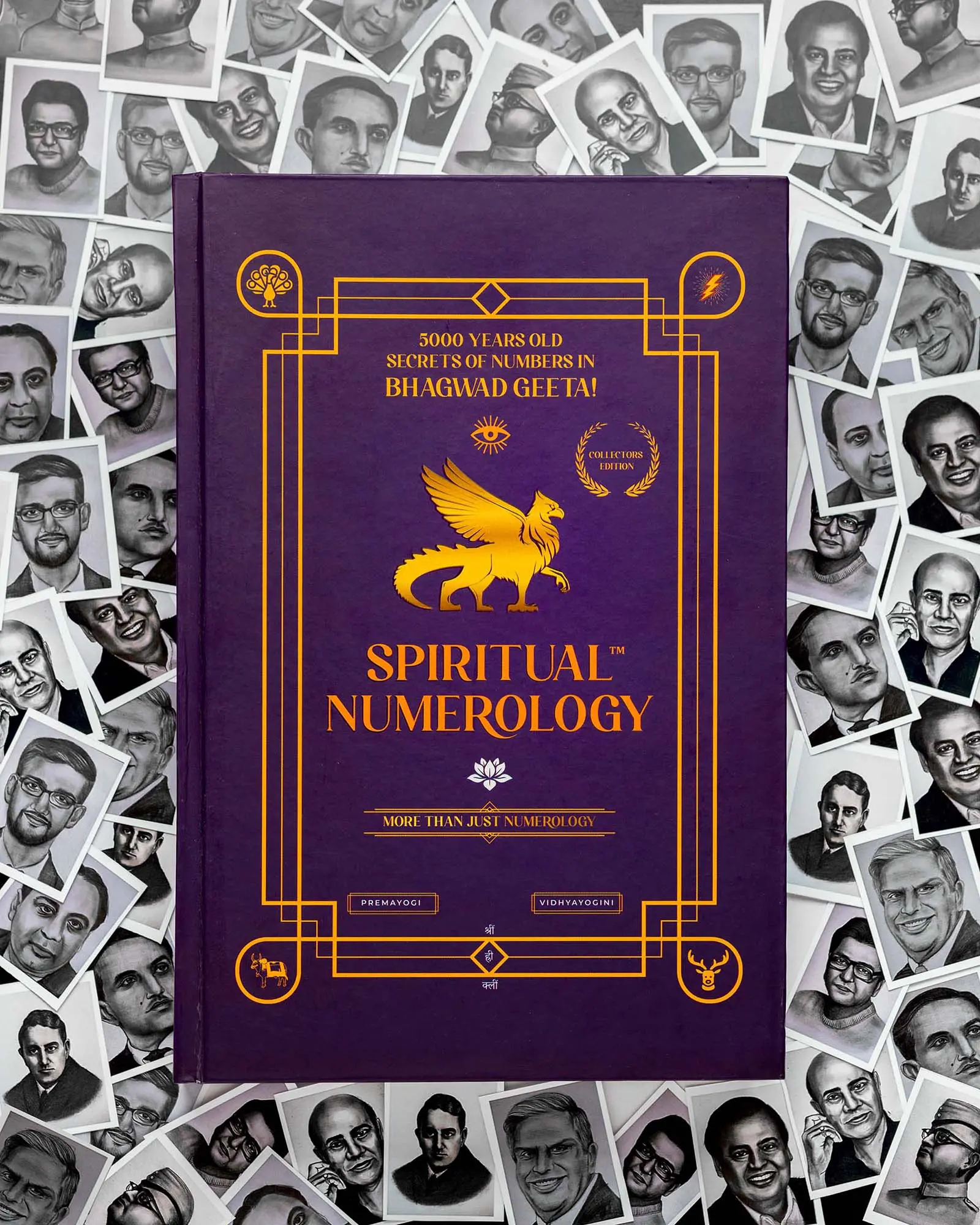
The number 108 — sacred in Vedic tradition — became the central graphic element. It wasn’t decoration. It was the brief. Every compositional decision asked: does this serve the number, or distract from it?
Throughout this shoot, I faced a challenge I hadn’t quite encountered before — visually representing something as intangible as knowledge and spirituality. But that challenge is what pushed me. I couldn’t just photograph a book. I had to get inside what the book meant.
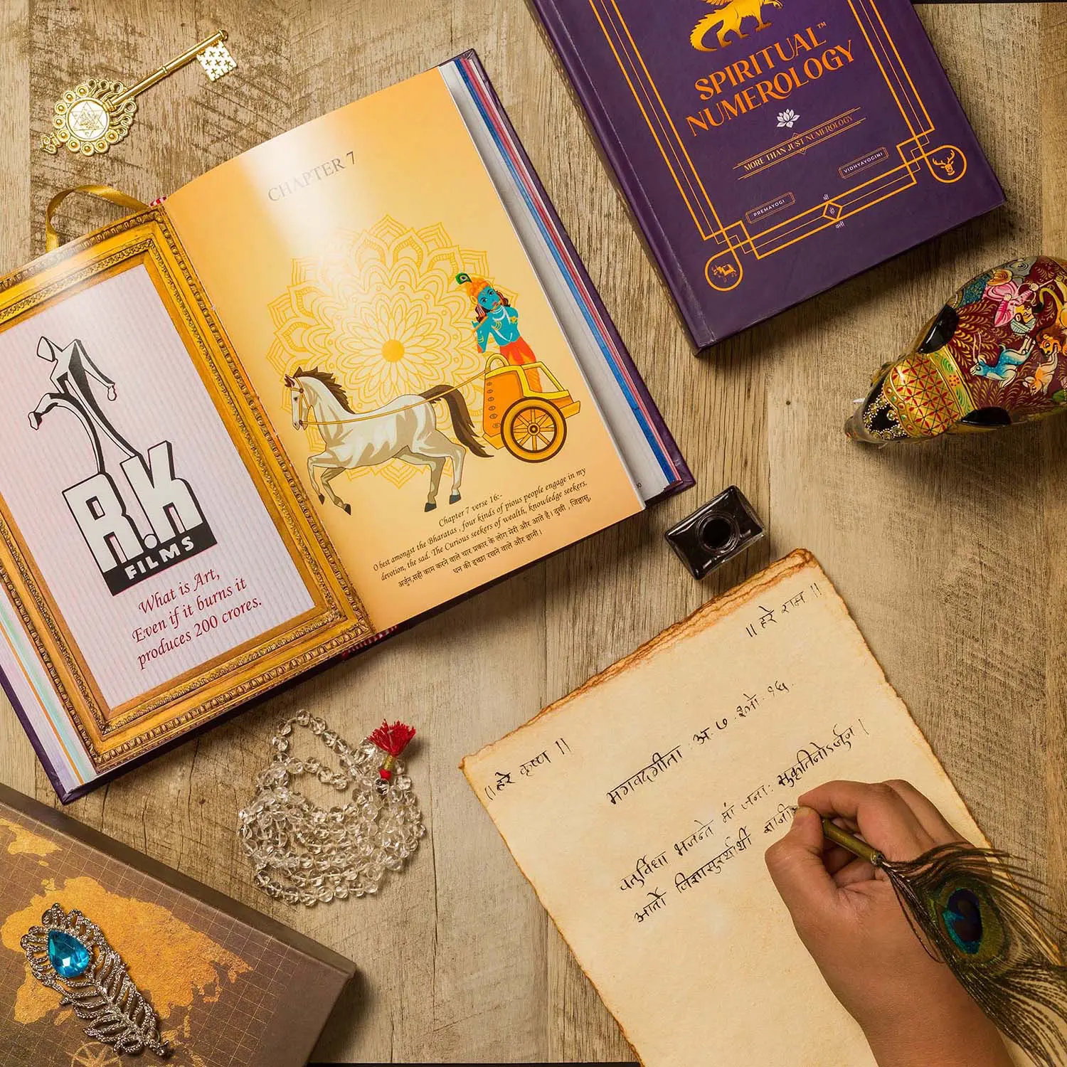
The connection between numerology, spirituality, and the teachings of the Bhagavad Gita opened up more creative possibilities than I expected. I went deep into the text, looking for things that resonated with the author’s perspective — and found that each page had something to offer visually.
What I kept coming back to was balance. The images had to reach a wide audience without losing the depth that makes the subject matter meaningful. Too simple and it felt hollow. Too layered and it lost people. Getting that right was the real work of this project.
This shoot reminded me why I do what I do. Composition, light, and attention to detail aren’t just technical decisions — they’re how you make someone curious enough to pick up a book they’ve never heard of.
Looking back, I feel genuinely proud of what came out of this. It tested my skills in ways a typical product shoot doesn’t, and it deepened my respect for photography as a way of making the invisible visible.

Let’s talk about what the campaign needs to say — before we decide what it needs to look like.
