Most product photography proves the product exists. On a marketplace grid, existing is not the job. The image has to win a one-second comparison against forty others at thumbnail size — before anyone reads a word you wrote.
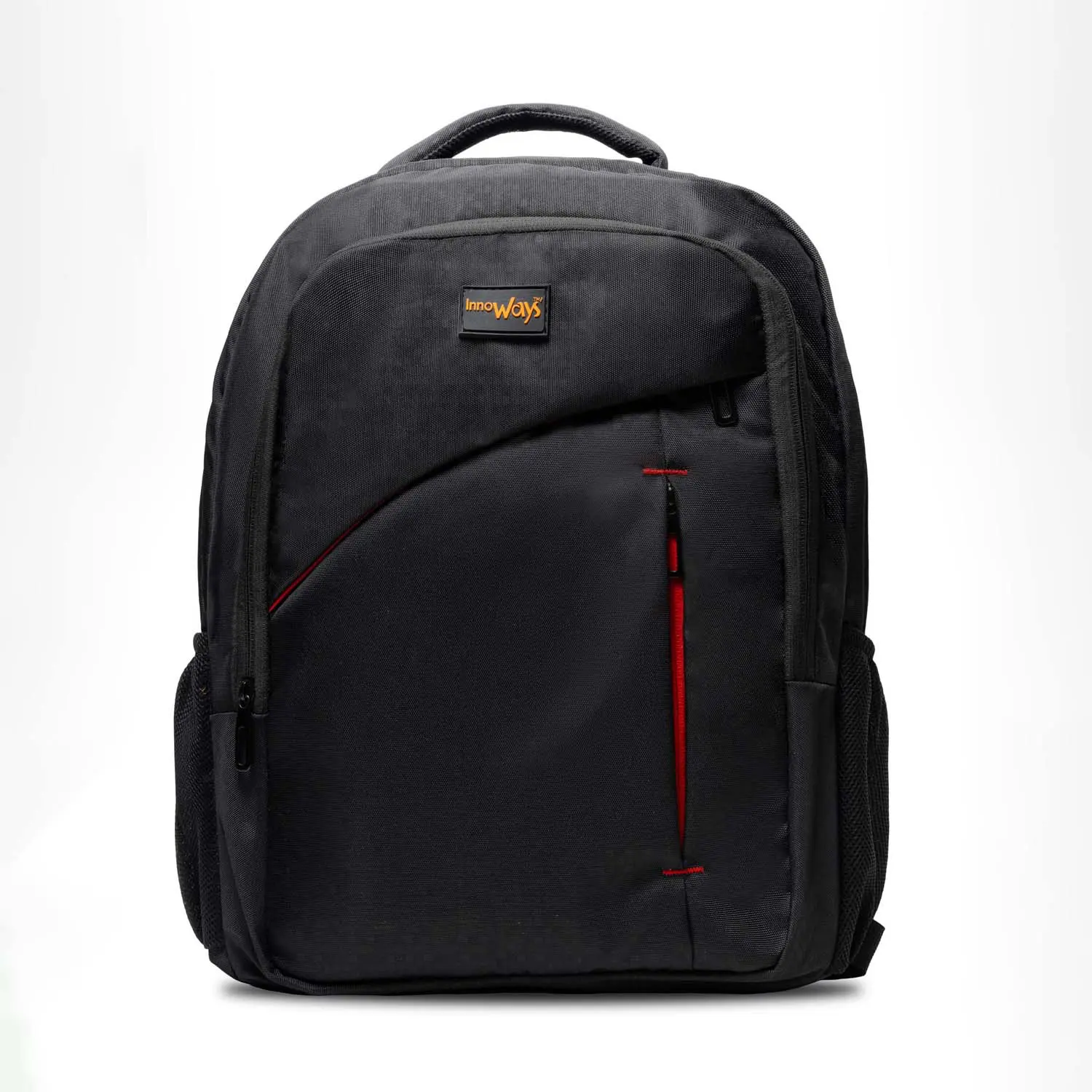
Two listings, one backpack, same price, same rank. Only the images inside the gallery are different — and only one of them keeps the sale after the tap.
Swipe the gallery, or use the ← → arrows
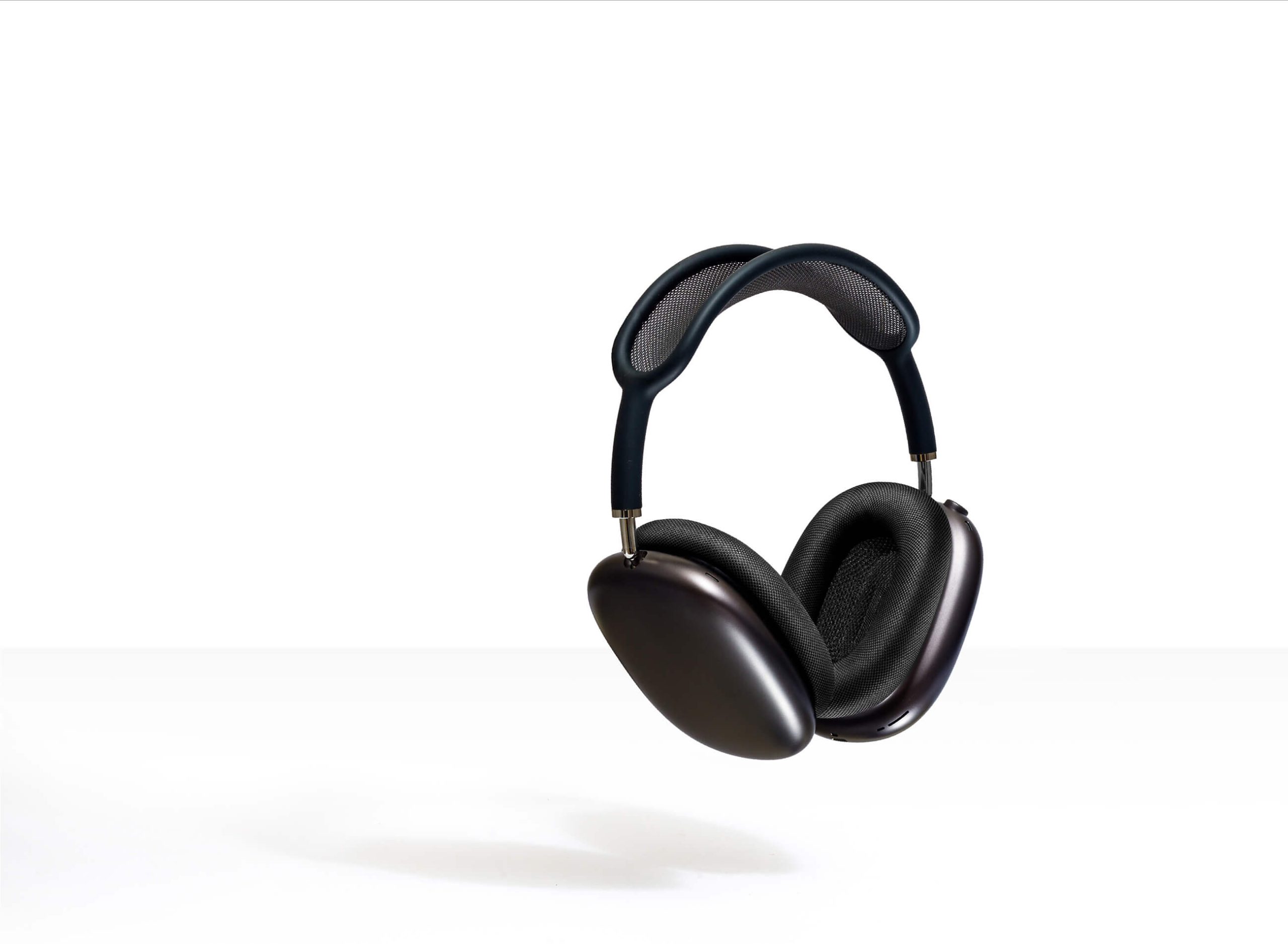
Every other image in your gallery only gets seen after the tap. This one is judged at roughly eighty pixels wide, against forty competitors, in about a second. Marketplace rules leave almost no room to differ: product on white, filling most of the frame, no text, no logos, no borders, no props — in the main image, on most platforms. What’s left is exactly what most sellers ignore.
Not the angle that looks best up close — the angle that resolves fastest when it’s the size of a fingertip.
Light that survives compression and a small screen, not just light that looks right in the studio.
Soft, muddy edges read as a stain at thumbnail size. A clean edge reads as a product.
A shade that shifts between the thumbnail and the doorstep is a return before it’s a sale.
The outline has to say what the product is before a single detail is visible.
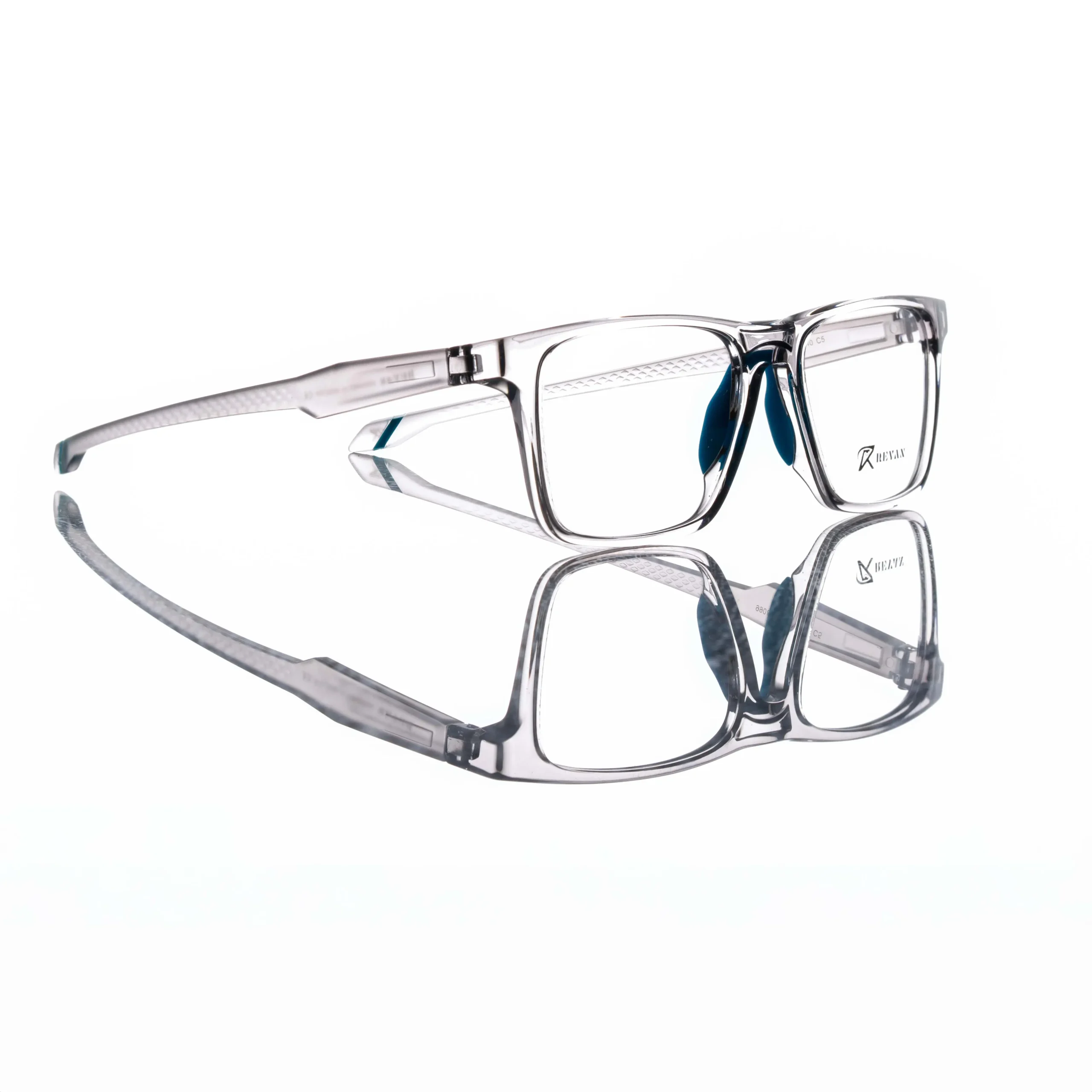
If it doesn’t read at 80 pixels, it doesn’t exist.
A buyer asks the same five things, in the same order, and never types any of them. A listing that skips a frame leaves one question open — and an open question is a closed tab.
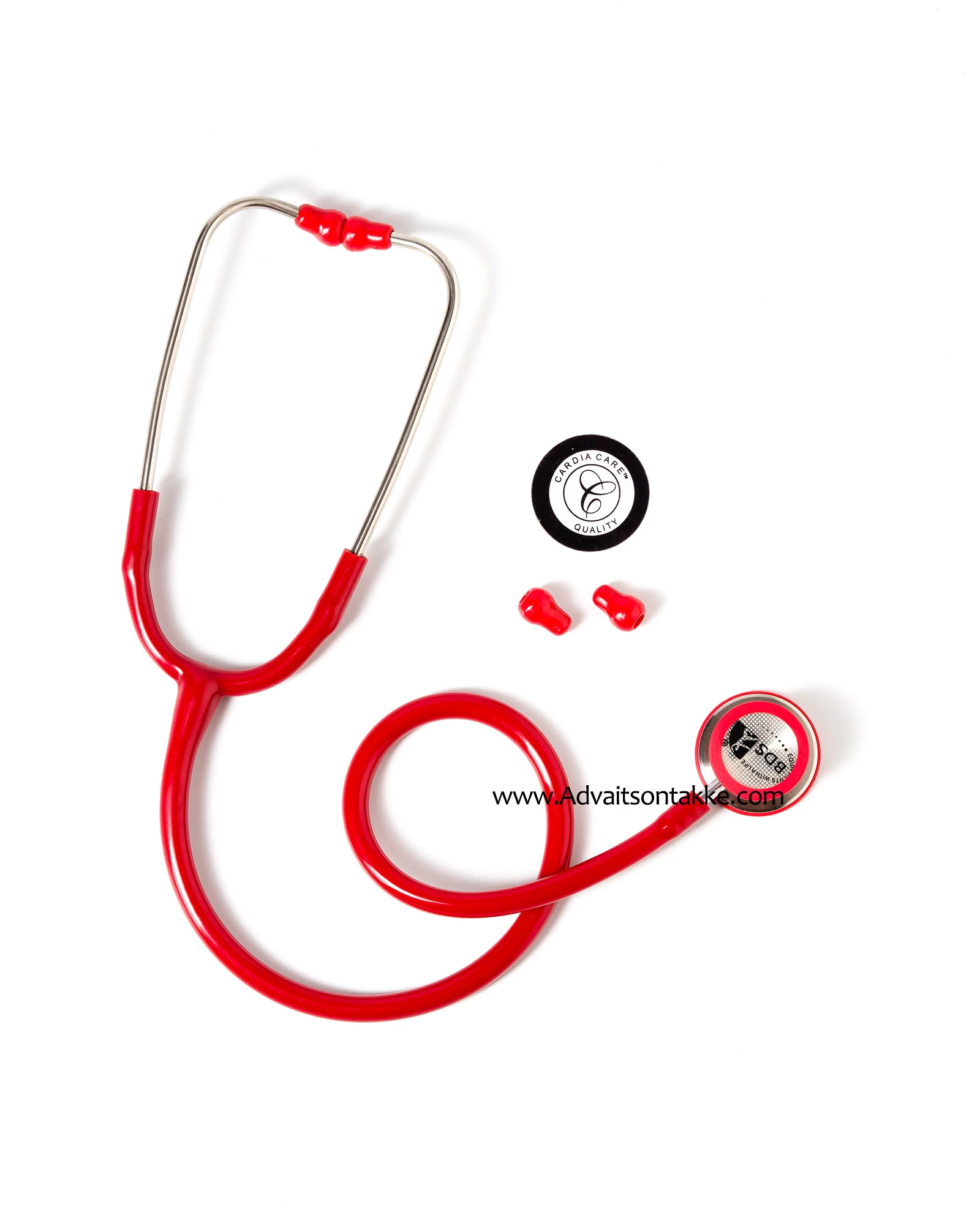
What is it?
One product, one clean background, the angle that reads fastest at thumbnail size. This is the frame that has to survive the grid before anything else gets looked at.

How does the range work?
Variants, sizes and the full line shot together. It tells a buyer what else exists, and it tells them the range was made by one brand, not assembled by accident.
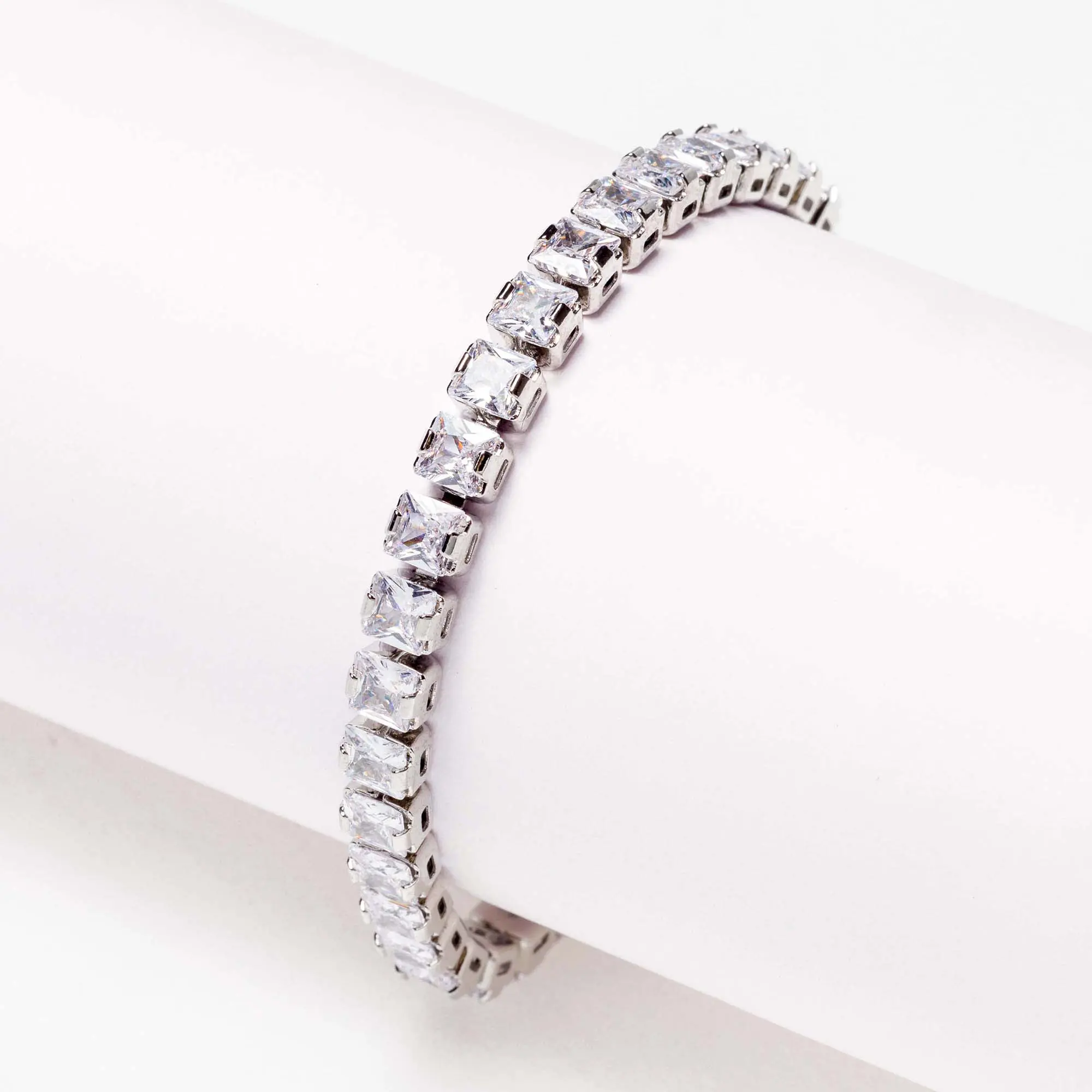
What is it made of?
Texture, finish, weave, seal, weight. The close frame does the job a spec table cannot — it lets someone judge quality without touching the thing.

What actually arrives?
The box, the label, the unit as it lands on a doorstep. Shown honestly, it removes the doubt that drives returns — and the review that follows a return.

Does the whole catalogue hold together?
One light, one background, one crop logic across every SKU. Consistency is what makes a store page look like a brand instead of a folder of uploads.
Amazon calls it A+ Content. Every other platform has its own name for the same block — the modules that sit below the description, for the buyer who’s still deciding. It isn’t built from copy. It’s built from photography: banners, story panels, comparison layouts and lifestyle frames, all made from images shot for the purpose.
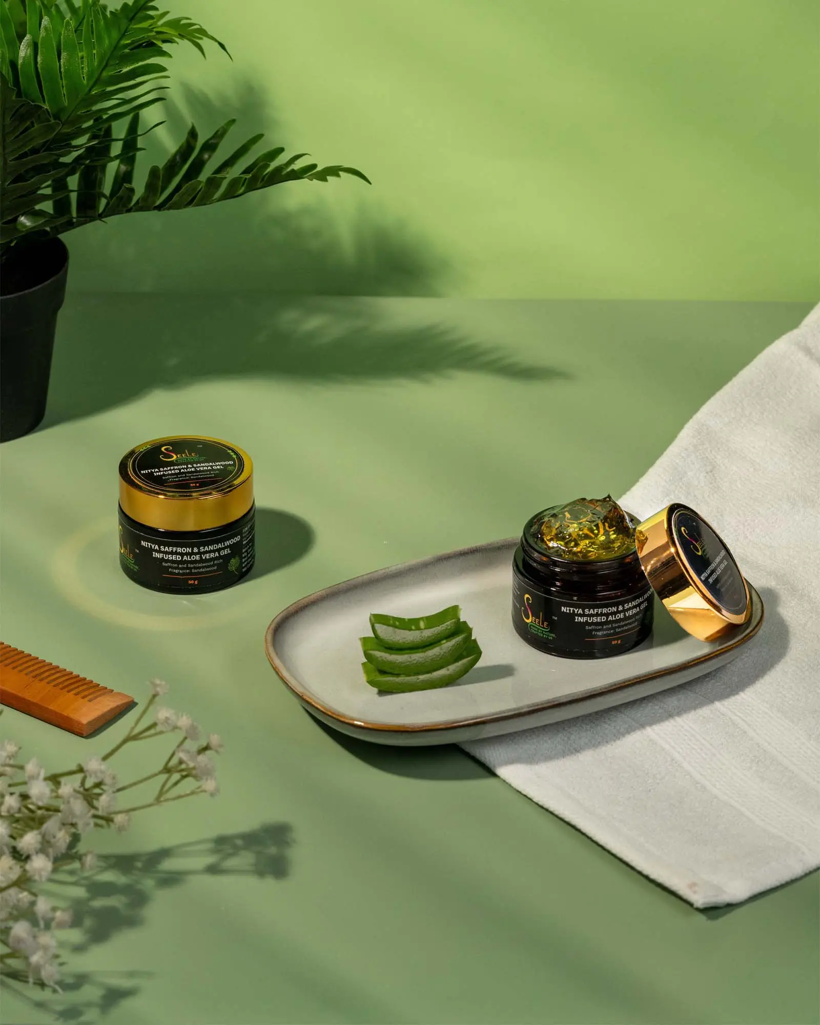
Seele
Made by nature, crafted by us


Consistent light

True-to-life colour
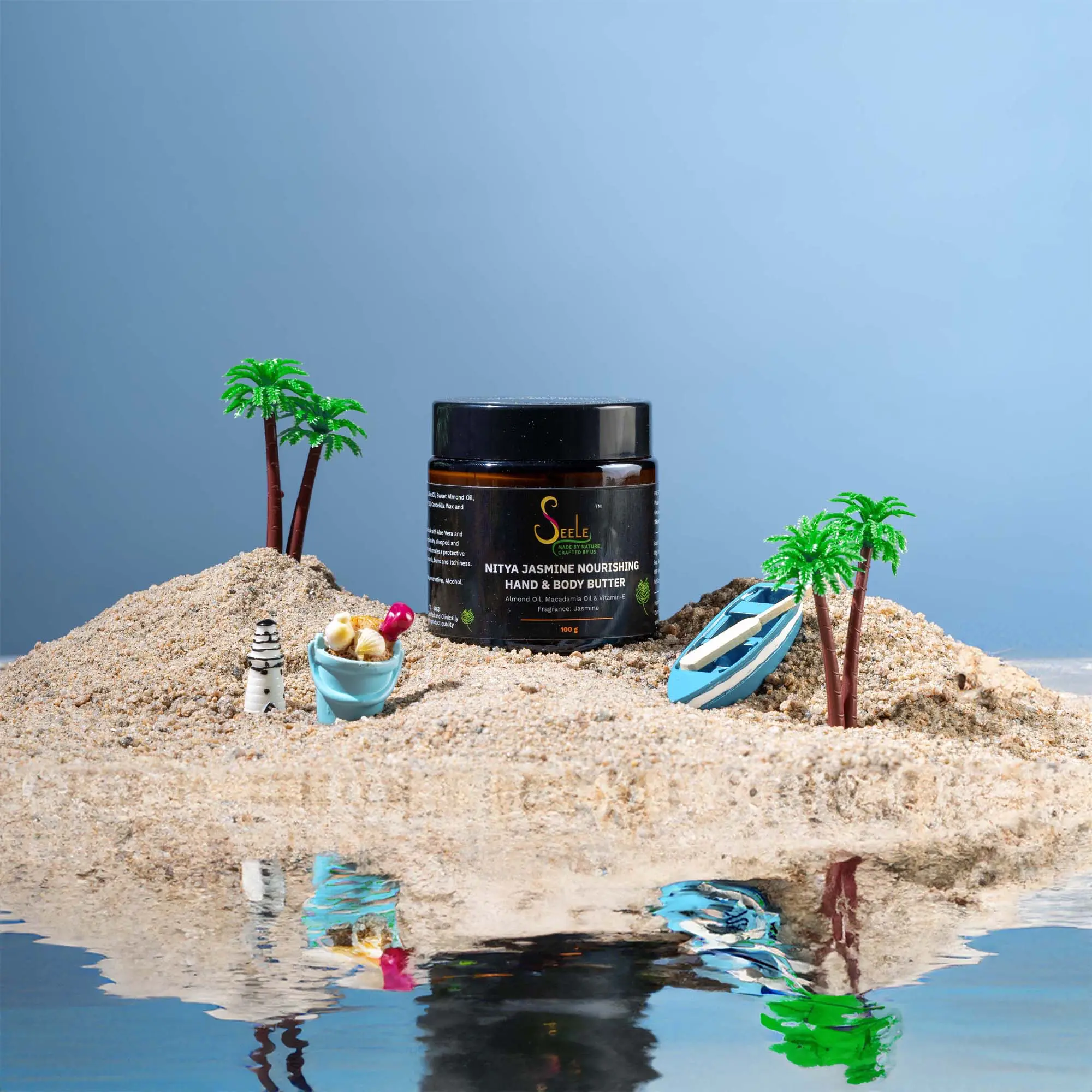
Texture you can read

In use
Shown where it is actually used.
The frame that answers “is this for someone like me?”
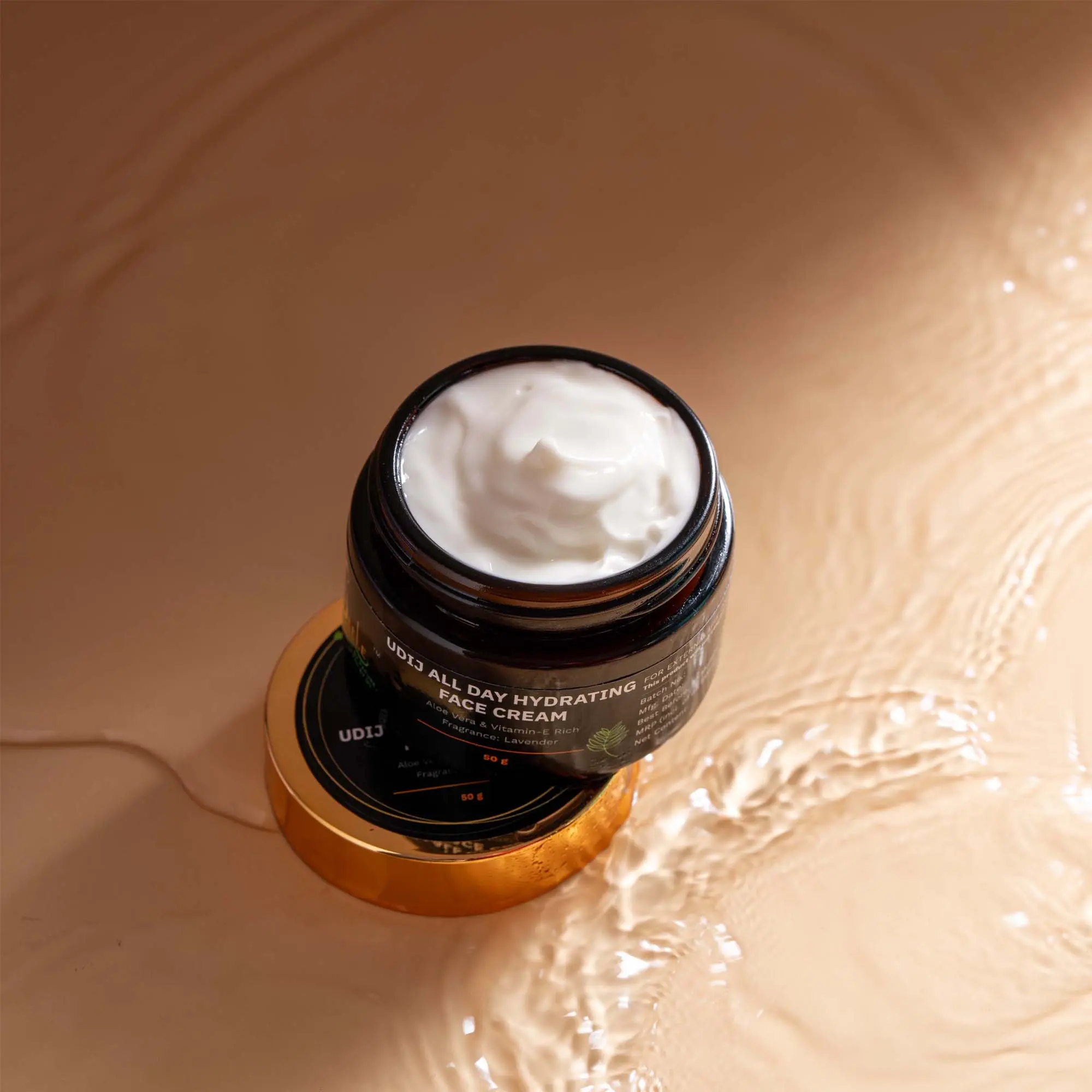
Four steps. One session.
Brief
SKU list before shot list

Set
One set held across the range
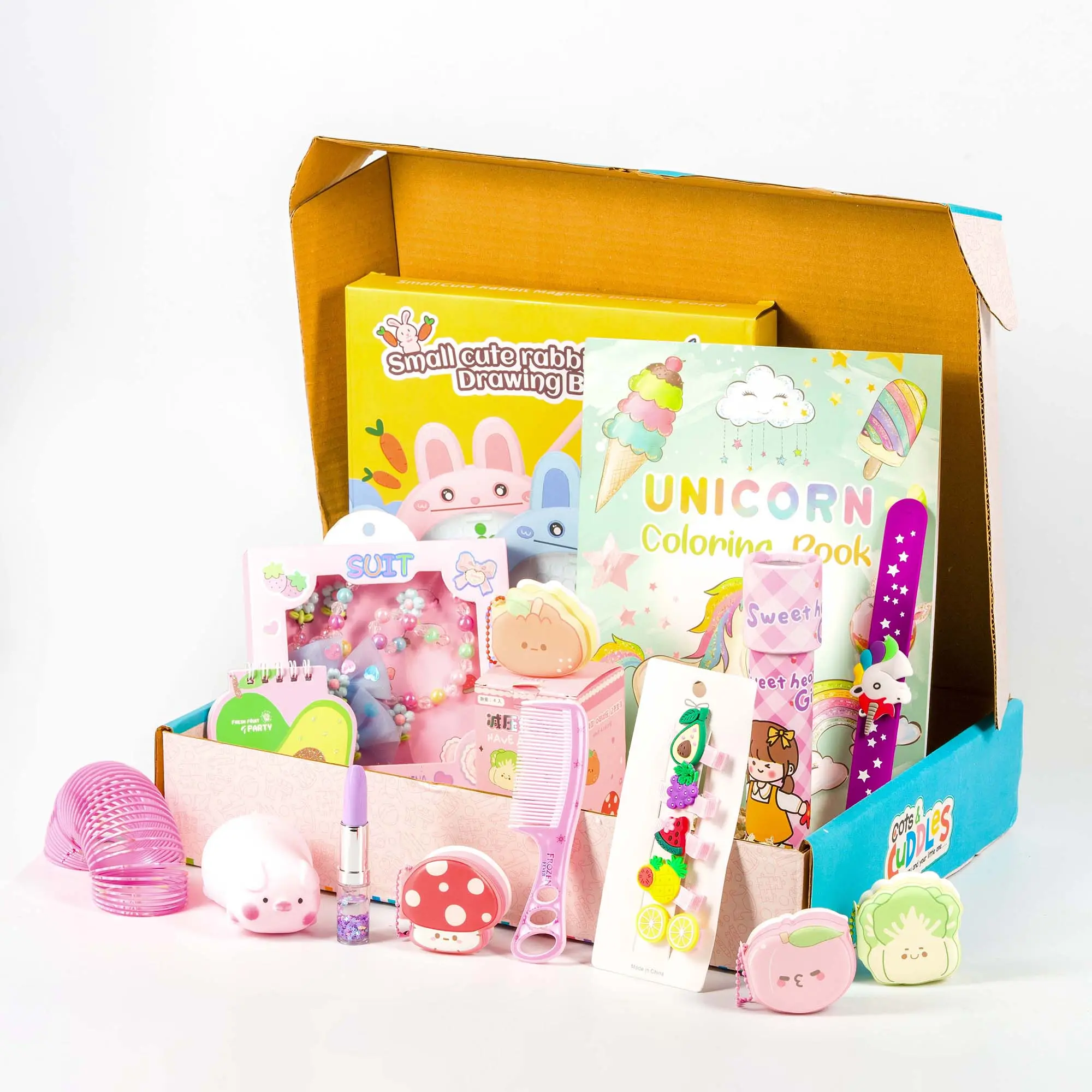
Shoot
Hero checked at thumbnail scale
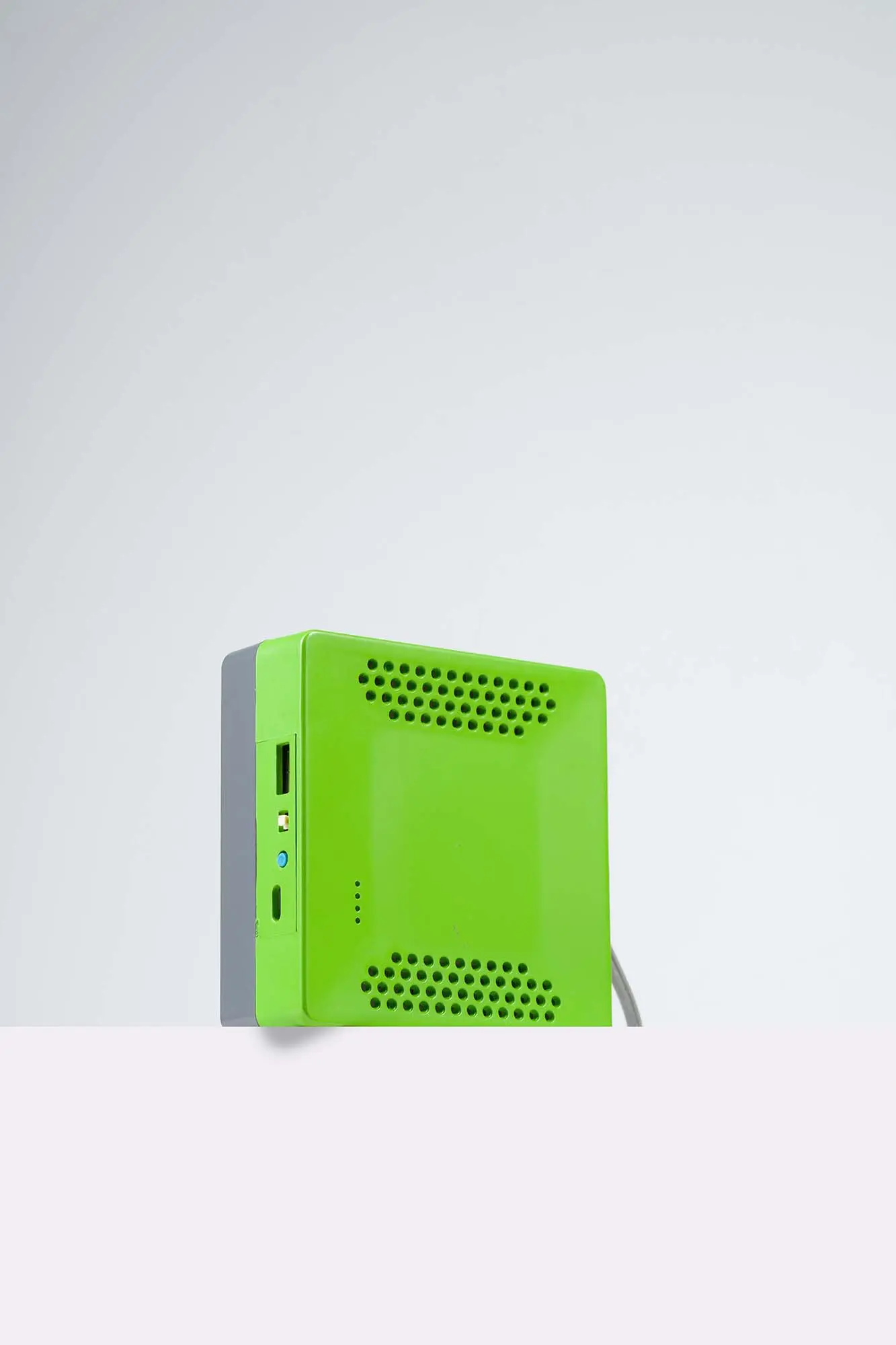
Delivery
Named, filed, cut to spec
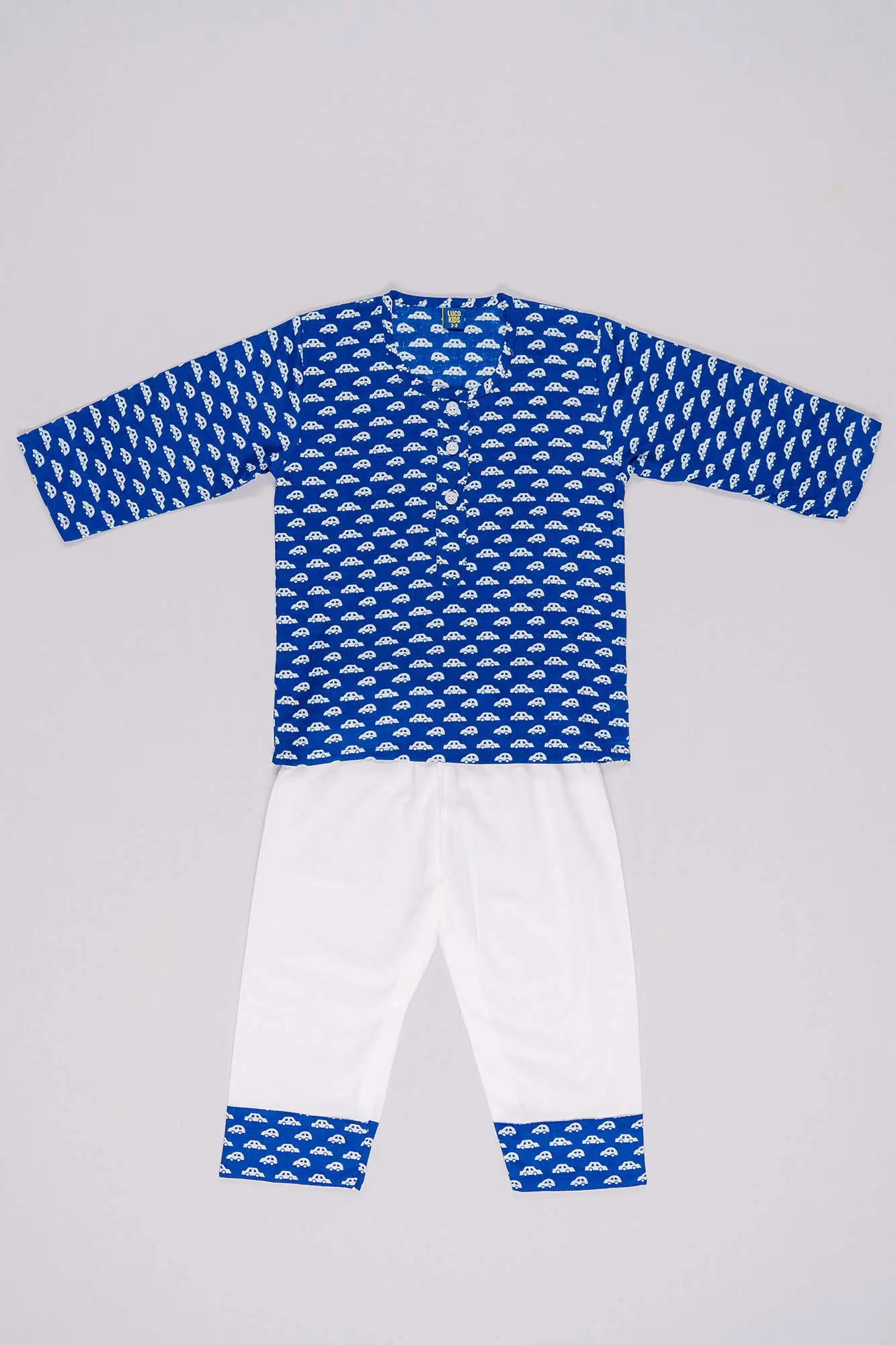
The same five questions, answered in pictures.



Tell us the range, the platforms and the deadline. We will tell you what the shoot needs to cover.