Project Architecture: Vedistry (Charak Pharma)
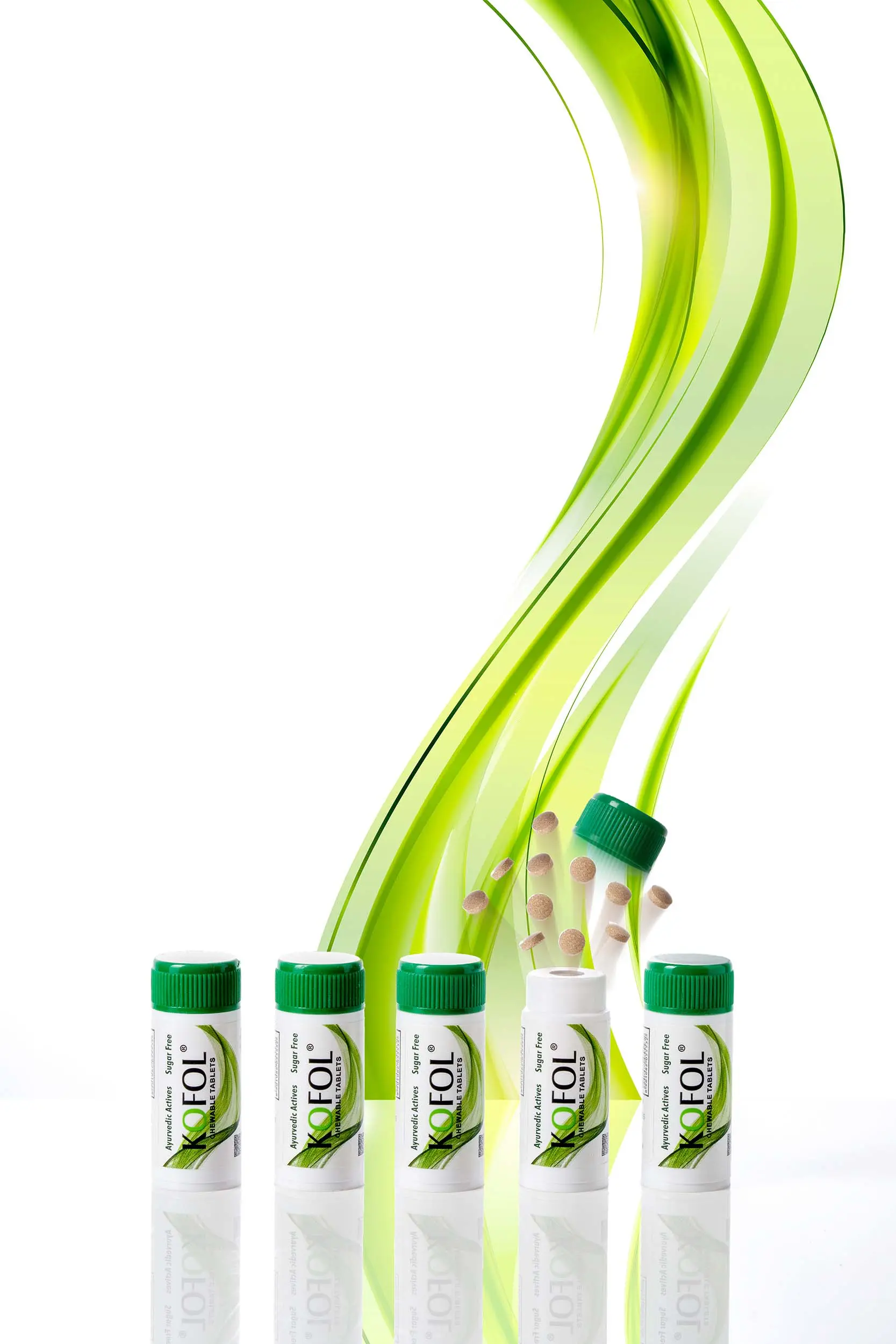
The Objective: To bridge the gap between traditional Ayurvedic roots and modern premium aesthetics, transforming a utility-based commodity into a relatable lifestyle experience.
The Strategy:
| Aspect | Tactical Approach |
|---|---|
| Brand Identity | The Green Family. A cohesive, muted palette designed to evoke natural vitality and organic energy. |
| Market Shift | Experience-Driven. Moving away from “formal and uninviting” medicine shots toward visual warmth and emotional connection. |
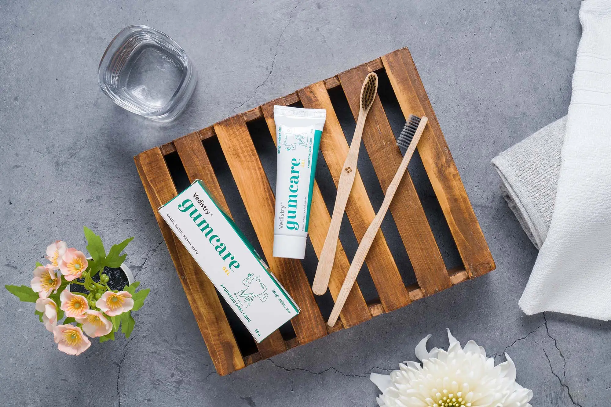
| Visual Style | Refined Minimalism. Clean, intentional styling using cohesive props that align with the brand’s color harmony. |
| Value Framing | Modern Wellness. Highlighting product benefits through fresh, relatable, and purpose-driven compositions. |