.


Campaign Production · Art Direction · Mumbai
A campaign that works doesn’t just look good.
It sells.

A campaign shoot is strategy before it’s photography. The brief, the direction, the creative decisions — all of it shapes whether the work moves people, or just occupies space.

Campaign Shoot
Content that could only be yours — not anyone else’s.

“The images were fine. But they could have been for any brand in your category. That’s the problem.”

What you get
A strategy session before the brief is written — your market position, not just your product spec
Full pre-production — references, mood, prop sourcing, and locations locked before shoot day
High-end campaign production directed with intent, not executed to a checklist
Performance-ready creatives cut for Meta, Google, and marketplace placements
Visual consistency across every touchpoint — ads, packaging, social, website
Delivered with file hierarchy and platform specs — ready to go live, not just look good
From
“Content that could be anyone’s”
To
“Content that could only be yours.”
Recent Result

112,000+ organic views in 48 hours for Enviroo Eco. Customers cited the visuals as the reason they purchased.

How a Campaign Is Built
Strategy before production. Always.
01 · Strategy
Market position before mood board

Where does your brand sit in its category? Who are you talking to, and what do competitors already own visually? This shapes every decision that follows.

02 · Pre-Production
Everything locked before shoot day

References, mood direction, prop sourcing, wardrobe, casting, locations, shot list. Nothing left to chance on the day.

03 · Production
Directed, not just photographed

Art direction on set — model direction, real-time creative decisions, lighting built for the brief. Every frame shot with a specific platform and use case in mind.

04 · Delivery
Platform-ready, not just finished

Edited, colour-graded, and cut for Meta, Google, marketplace, website, and social — with file hierarchy and platform specs included. Ready to go live immediately.

How We Think
From the first message to the final frame.

One brief. Every decision that followed — documented.

Case Study · 01
Tash Bags
Lifestyle · Luxury · D2C

Handcrafted brass potli bags rooted in ancient Indian design philosophy. The brief asked for premium and ethnic. The real job was making something heritage feel inevitable on a modern woman — without losing what makes it sacred.

Outcome
D2C brand — successful brand awareness and conversion
Tash Bags handcrafted brass potli bag product photography
The Brief Tash Bags · Ladies Handbag Label · Category: Lifestyle / Luxury

To produce a high-impact visual that reflects the brand’s foundation in ancient Indian design philosophy — highlighting the uniqueness of handcrafted brass bags while deeply rooting the visuals in Indian values, ethnic aesthetics, and traditional elegance.

Color HarmonyBalanced colour tones — warm, earthy, cohesive
Wardrobe StylingTraditional Indian sarees
Product InteractionCreative and intentional holding by the model
Emotive DirectionSensual, elegant, and feminine expressions
Lighting StrategyPrecise technique to manage brass reflections
SymbolismElements that evoke ancient sacredness and rooted design philosophy
Fashion StylingAccurate styling to ensure product remains central and aspirational
Sub-themesGlamour, Bold, Elegant — each with distinct palette and wardrobe direction
Theme 01 — Colour & Character
Direction starts before the camera does.
How the creative direction started
Tanu — Tash Bags
My current brass jewelry collection pairs beautifully with sarees. I’m looking to plan a campaign shoot around this styling direction.
Advait
Understood. Here’s how I’ll approach it.

The saree and model are the canvas. What I’m really directing is everything around that — because the product is the bag, not the model.

I’ll start with expression and emotion. What should someone feel when they see her?
Tanu — Tash Bags
Confident. Feminine. A little bold.
Advait
Good. That tells me the pose language — she holds the bag with ownership, not display.

From there I’ll map the styling to that character. Wardrobe, drape, and blouse cut chosen so the composition serves the product — because that’s where your chain drops and your bag lives on camera.

Background and props will be picked to complement the brass, not compete with it. Warm tones that let the metal breathe.

Lighting is where it becomes a campaign and not just a photo. Brass is a reflective material — one wrong source and it reads flat. I’ll build the setup around the product first. The model wraps around that logic.

The pose is the last decision and the most important one. Because if the model outshines the bag, we’ve made a fashion shoot — not a campaign.
Tanu — Tash Bags
This is exactly the kind of thinking I was looking for.

(Indicative of how this brief was discussed.)

Pink silk saree chosen for softness against the brass. Deep crimson backless blouse for sensuality and boldness — and to expose the back, where the bag hangs. Terracotta red background echoes the warmth of the metal. The prop vase, the flower, the bangles — every element in the same warm palette. Nothing arbitrary.

The model turned away from camera. Showing the back rather than the face created mystery — and moved the eye exactly where it needed to be: the bag on the chain.

Tash Bags campaign — Theme 01, pink silk saree with brass potli bag, terracotta background
Theme 02 — Light as Hierarchy
Tash Bags campaign — Theme 02, model in shadow with lit brass product
The model was darkened intentionally. The product was not.

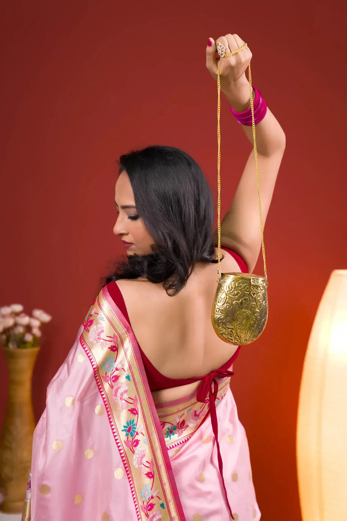
Four lights. One job: make brass brightest thing in frame. The model, consequence of the same setup, falls into shadow. This was the choice; not a mistake.

A snoot on the key light focused specular highlights precisely onto the product. A gobo projection light threw a shadow pattern across the background, adding depth without competing with the subject. The hair light on the north-east axis created separation from the background. A secondary fill opened the shadow side just enough to retain form. A reflector beneath the model bounced upward to soften any harsh fall-off. The model’s expression, caught in that shadow, made it work. You felt her presence even as the bag outshone her.

4-Light Setup — Top-Down View NORTH — BACKGROUND WALL SOUTH MODEL PRODUCT REFLECTOR intentional shadow CAMERA 1 SNOOT KEY Brass specular 2 GOBO PROJECTOR BG pattern 3 HAIR LIGHT Separation 4 FILL LIGHT Secondary N S TOP-DOWN VIEW — NOT TO SCALE
1 — Snoot / Key (specular on brass)
2 — Gobo Projector (BG shadow pattern)
3 — Hair Light (model separation)
4 — Fill / Secondary (shadow side)
Further Work
Two more briefs. Two different problems.
Spiritual Numerology Book by Vinay Gondaani — campaign photography
Case Study · 02
Spiritual Numerology
Publishing · Concepts & Ideas

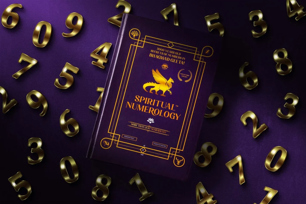
The brief was a book on numerology rooted in Bhagavad Gita philosophy. The challenge: make knowledge visible. Every composition had to balance accessibility with depth — speak to a wide audience without simplifying what the author spent years building. Visual metaphors over product display. Atmosphere over information.

View full series →
Serumique serum campaign photography
Case Study · 03
Serumique
Beauty · Skincare · D2C

The serum category is saturated with images that look identical — white background, floating product, clinical lighting. The job here was to build product presence without borrowing the category’s visual clichés. Cinematic light. Controlled depth. Six frames that earn the price point before you read the label.

View full series →
Your brand deserves a visual world
that’s unmistakably yours.

Let’s talk about what the campaign needs to say — before we decide what it needs to look like.

Campaign Shoot Photographer Mumbai | Brand & Product Campaigns — Advait Sontakke
image/svg+xml

Premium Professional Campaign Shoots

View this post on Instagram

Editor’s Picks